
 English
 русский
 Français
 Español
 Deutsch
 عربى
عربى


Wallpaper and Paint Combinations: Proven Formula, Placement Tips, and Mistakes to Avoid
Content
- 1 Start with a Color Extracted from the Wallpaper
- 2 Where to Use Wallpaper and Paint Together
- 3 Three Rules for Choosing Paint Colors That Work with Wallpaper
- 4 How to Test a Wallpaper and Paint Combination
- 5 Common Mistakes to Avoid
- 6 Wallpaper and Paint Combinations for Hospitality and High-Traffic Spaces
Start with a Color Extracted from the Wallpaper
Most wallpaper and paint combinations fail not because the colors clash, but because there is no clear relationship between them. The simplest fix is to choose your wallpaper first, then pull the paint color from one of the tones already present in the pattern. This creates a connection that feels intentional, even if the paint is a lighter or darker version of that tone.
When you examine a wallcovering, you will usually find a dominant background color and one or two secondary colors. For a calm, easy-to-live-with room, select a paint color from the background or from the dominating mid-tone. For a more striking look, use a secondary color: the one that covers roughly 20 to 30 percent of the pattern. A natural leaf pattern, for instance, works well with a warm cream background on the walls and a deeper green on the woodwork. As a wallpaper manufacturer, we design our collections with this pairing logic in mind. Our natural nonwoven wallpaper collection, for example, is built around earthy tones that have coordinated paint relationships already built in.
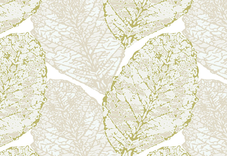 Wholesale Natural Nonwoven Wallpapers Suppliers, CompanyAs China Natural Nonwoven Wallpapers Suppliers and Natural Nonwoven Wallpapers Company, Kainolin offer Wholesale Natural Nonwoven Wallpap...View Product →
Where to Use Wallpaper and Paint Together
Placement matters as much as color. The same wallpaper and paint combination can look completely different when you move it from a wall to a ceiling or from a full wall to a panel. These placement strategies have proven reliable in both residential and commercial settings. For a starting point, browse our get inspired gallery to see how our products look in real rooms before you choose a paint shade.
Above Wainscoting and Chair Rails
Painting the lower wall and adding wallpaper above the chair rail is a classic arrangement that adds durability where people touch the wall the most. Use a satin or semi-gloss paint for the lower section to allow easy cleaning, and keep the wallpaper above for visual texture. In corridors or kids rooms, choose a washable wallcovering for the top section so maintenance stays manageable.
In Molding Boxes and Recessed Alcoves
Wallpaper installed inside a molding frame or a recessed alcove turns a flat wall into a designed feature. Paint the surrounding wall in a solid color drawn from the wallpaper’s background. The contrast between the textured pattern and the flat paint gives the room depth without requiring a full accent wall. This approach is especially effective in dining rooms and entryways, where the eye naturally settles on the framed area.
As an Accent Wall
An accent wall remains one of the most flexible ways to use wallpaper and paint together. Paint all other walls in a neutral version of the wallpaper’s background color, then apply the pattern to one wall only. Select the wall that faces you when you enter the room. With a peel-and-stick option like our modern peel and stick wallpaper collection, you can test the combination first because the material is easy to apply and remove without damaging the wall. This makes the accent-wall route particularly forgiving for rental spaces or quick refreshes.
 Wholesale Modern Peel And Stick Wallpapers Suppliers, CompanyAs China Modern Peel And Stick Wallpapers Suppliers and Modern Peel And Stick Wallpapers Company, Kainolin offer Wholesale Modern Peel An...View Product →
Behind Shelving and Storage
Open shelving and bookcases look more intentional when the wall behind them is covered in wallpaper while the surrounding walls stay painted. The pattern acts as a backdrop that highlights objects without competing with them. Choose a small-scale pattern that remains visible between shelf gaps, and keep the shelf units neutral so they do not fight the wallpaper’s texture.
On the Ceiling
Painting walls and wallpapering the ceiling is a bold move, but it can make a small room feel more intimate. Choose a small-scale pattern in light-to-medium tones for the ceiling, and paint the walls a shade slightly deeper than the wallpaper’s main background color. The contrast stops the ceiling from feeling heavy while still drawing the eye upward. This combination works well in powder rooms, reading nooks, and bedrooms where people spend time lying down or looking up.
Three Rules for Choosing Paint Colors That Work with Wallpaper
Once you understand placement, the next step is selecting the exact paint shade. These three rules cover most wallpaper and paint combinations, whether you are working with a subtle texture or a dense damask pattern.
Pull From the Background or Secondary Tone
Do not try to match the paint exactly to the smallest accent color in the wallpaper. That hyper-specific match can flatten the pattern. Instead, choose a tone that feels visually adjacent. If the wallpaper has a warm beige background, use a cream or greige paint. If the pattern contains a mustard accent, consider a muted ochre paint that echoes it without repeating it exactly. The relationship should be recognizable, not identical.
Let Light and Room Size Decide the Shade
A paint color that looks perfect on a store sample can turn cold or muddy when placed next to a specific wallpaper. Test your paint sample alongside a full sheet of the wallcovering in the actual room. North-facing rooms receive cooler light, so offset them with a warmer paint tone. Small rooms benefit from lighter paint shades that let the wallpaper become the focal point. Large rooms can carry deeper paint colors without feeling overpowering.
Match the Finish to the Wallcovering
The paint sheen also affects how the combination reads. A glossy paint next to a matte wallpaper can look disconnected, while a semi-gloss paint next to a textured nonwoven wallcovering often feels more coherent. For most wallpaper and paint combinations, use a satin or eggshell finish on the main walls and a semi-gloss finish on trim and doors. If your wallcovering has a pronounced texture, avoid high-gloss paint in the same sightline because it reflects light differently and draws attention away from the pattern.
How to Test a Wallpaper and Paint Combination
Snap decisions are expensive when wallpaper and paint are involved. A sample strip from a store will not show you how a pattern reads across a full wall or how the paint color shifts under your lighting. Instead, set up a proper test before you order the full quantity.
Ask for a physical wallpaper sample or a roll remnant that gives you at least 50 by 50 centimeters of the pattern. Paint a large piece of primed drywall or foam board with your candidate color. Place the painted board directly beside the wallpaper sample and lean it against the wall where the installation will happen. Observe the combination in natural morning light, in the afternoon, and under artificial light in the evening. Move the sample around to different walls because the same paint color can look different next to a window than it does in a dark corner.
If you are selecting wallpaper for a larger project, also stand at the distance someone would normally view the wall from. Large patterns close up can feel overpowering from across a corridor. This simple test filters out most disappointing wallpaper and paint combinations before you invest in materials and installation time.
Common Mistakes to Avoid
Even experienced renovators make avoidable mistakes when mixing wallpapers and paints. Watch out for these common pitfalls.
- Matching the paint too literally to a wallpaper color, which makes the room feel flat and removes the visual depth that patterns provide.
- Ignoring the color of trim, doors, and fixed cabinetry. If the painted wall picks up a color from the wallpaper but the woodwork stays in a clashing tone, the combination will still feel broken.
- Overloading a single room with multiple bold patterns. If you have wallpaper with a large motif, keep the paint solid and the textiles relatively quiet.
- Skipping a large-format sample test. Color chips are too small to show how the wallpaper pattern and the paint will interact across a full wall. Always test with a panel large enough to show the pattern repeat.
Wallpaper and Paint Combinations for Hospitality and High-Traffic Spaces
In hotels, offices, and other high-traffic spaces, wallpaper and paint combinations must also hold up to wear, cleaning, and changing guests. The right base material changes how you pair the wallcovering with paint.
| Base Material | Texture and Appearance | Durability | Best Paint Pairing |
|---|---|---|---|
| Nonwoven wallpaper | Breathable, natural texture with a matte look | Good for guest rooms and low-contact areas | Satin or eggshell paint in light-to-medium tones |
| PVC wallpaper | Smooth or lightly embossed, easy to wipe | High resistance to moisture, cleaning, and scratches | Semi-gloss paint on lower walls and trim |
| Peel-and-stick wallpaper | Flexible film with printed patterns | Suited for temporary installations and frequent updates | Flat or matte paint that will not compete with the printed pattern |
For a hotel corridor, a classic PVC wallcovering paired with a semi-gloss painted wainscot is a low-maintenance choice that still looks intentional. In guest bedrooms, nonwoven wallcoverings create a softer atmosphere and pair naturally with a satin finish. Our classic PVC wallpapers are often specified for public areas because they clean easily and accept a wide range of paint color combinations. If you are managing a rental property or a boutique space with seasonal design changes, peel-and-stick materials give you the flexibility to repaint between tenants.
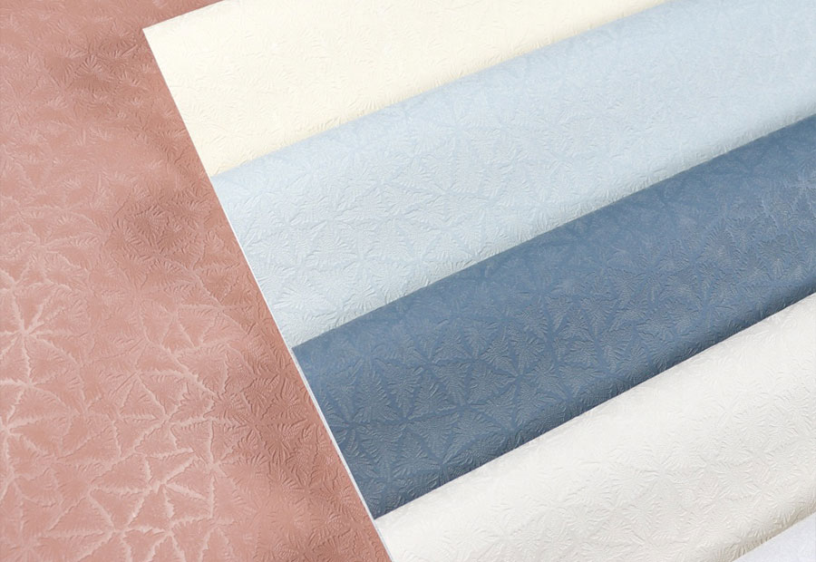 Classic Solid PVC Wallpapers Suppliers, CompanyAs China Classic PVC Wallpaper Suppliers and Classic Solid PVC Wallpapers Company, Hangzhou Kainolin Decorative Materials Co., Ltd. offer...View Product →
Before you commit to a wallpaper and paint combination, always confirm the exact wallcovering base material and its cleaning requirements. A styled combination will only look good over time if the products can handle the conditions in that specific room. You can explore all our wallcovering options on our wallpaper collections overview page, and for a closer look at how the market is moving toward customizable and sustainable wallcoverings, see our high-end interior design exhibition coverage.
EXCLUSIVE ACCESS TO PRODUCTS,
OFFERS AND INSPIRATION
-
Quick Links
Wallpapers Customize Our Story Factory News Contact Us -
Contact Us
+86-19157608277 [email protected] Room 509, T2, Fuyi Garden Center, Shangcheng District, Hangzhou City, Zhejiang Province, China

 Eco Friendly Wallpaper Manufacturer Hotel Wallpaper Supplier